
Have you noticed a shift in the stock market lately? The numbers are hinting at something different. While job stats dipped a bit, the S&P 500 bounced back with a surprising boost.
Imagine putting together a puzzle with a few pieces missing. Every piece, be it job numbers or hints of potential rate cuts by the Fed (when they lower interest rates to stimulate the economy), helps us see a clearer picture of an economy in transition.
In this post, we take a closer look at these trends. We explore how they spark a cautious sense of hope and open the door to fresh opportunities for those watching the market closely.
Analyzing Current Stock Market Trends

Today, let's chat about some fresh insights from the stock market. The latest update shows that job openings are now fewer than the number of unemployed workers. In August, the figures came in at just 22,000 new jobs, well below the expected 75,000. This small slip nudged the unemployment rate up from 4.2% to 4.3%, prompting many to reconsider the broader economic picture.
Investors see these numbers as pieces of a bigger puzzle. Real-time updates, like those on current market trends at nftcellar.net, give a quick snapshot of how the market is moving. It’s all about connecting the dots between job data and overall economic performance in a fast-paced environment.
There’s also a lot of talk about a possible Federal Reserve rate cut at the September meeting. In fact, there’s almost a 100% chance the Fed will lower rates, and a slim 12% chance that the cut might hit 50 basis points (a basis point is simply one-hundredth of a percent). Plus, the S&P 500 has bounced back impressively with a rise of over 25% from its April lows. Even with the softer labor market, this surge signals that investors are betting on a fresh strategy and adjusted economic signals.
Just like Marie Curie, who once carried test tubes of radioactive material in her pockets before becoming world-renowned, today's market throws unexpected surprises our way. It reminds us to stay adaptable and keep an eye on every twist and turn.
Historical Stock Market Trends: Lessons from a Century
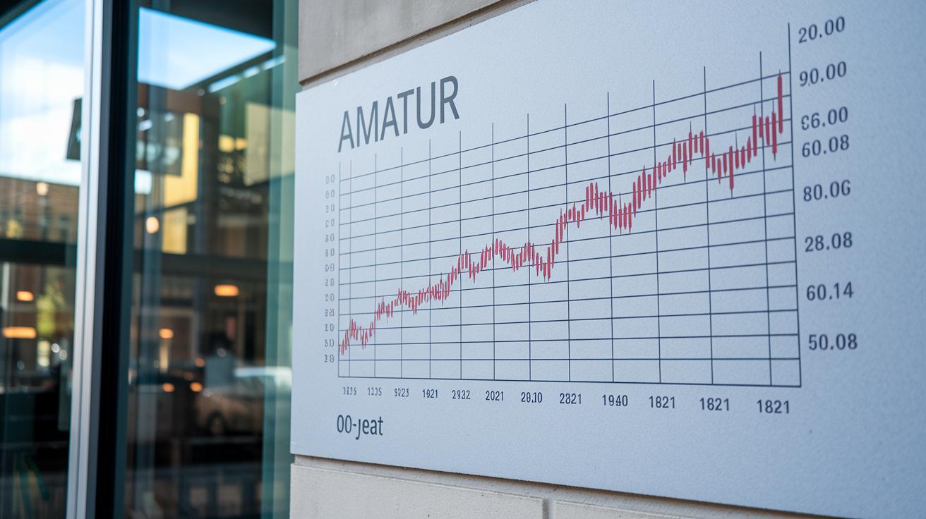
The 100-year Dow Jones Industrial Average chart shows us how stock market trends have changed over time. Each point on the chart represents the closing value at the end of a month. These values are adjusted using the headline Consumer Price Index (CPI, which is a measure that shows how prices change over time). In other words, the chart tells you how much a dollar was really worth each month.
This collection of data gives us a long view of the market, showing us the natural ups and downs over the decades. Think of it like a roller coaster ride, with steep climbs and sudden dips that capture the mood of the market. It’s like getting clues from the past that still help explain what we see today.
Each monthly DJIA level is updated every hour. That means you can look at data from before the Great Depression right alongside modern figures. Comparing these different periods helps investors get a clearer picture of what might be affecting today’s market, even though times have changed quite a bit.
The dataset is also easy to search and download, which makes it a handy tool for spotting patterns over the years. You can study how things like changes in government policies, new technology, or big global events have shaped the market. It’s a bit like reading a story, where each chapter builds on the last and helps you understand the whole picture.
For more examples beyond U.S. stocks, why not check out financial market examples at https://ebusinessplanet.com?p=6009? Taking a look at this wider view can give you even more insights into today’s economic signals.
Forecasting Stock Market Trends: Tools and Techniques

Investors these days mix number crunching with expert opinions to catch shifts in market sentiment. They work with hard figures, like the Producer Price Index (PPI, which tells us the prices producers get for their goods), and blend that with insights from seasoned analysts. It’s a bit like following a simple recipe: add solid data, stir in some expert views, and you have a recipe for understanding market trends.
Research teams have stepped up their game over time. They now combine quick, data-driven models with deeper, experience-based insights. This lets them compare the market’s day-to-day buzz with long-term trends. In short, they can spot new patterns while staying clear of old, repeating signals.
By updating their methods, analysts can catch even the smallest market pulses. This means they adjust their forecasts to mirror both recent changes and lasting economic trends.
| Method | Detail |
|---|---|
| Quantitative Models | Using number-based tools and key economic clues |
| Qualitative Insights | Drawing on expert opinions and the market’s mood |
| Hybrid Approach | Mixing real-time data with broader trend analysis |
- Investment strategies now focus on blending these techniques for clearer insights.
- Teams compare immediate market moves with long-term economic signs to spot shifts.
Together, these methods offer a flexible framework for forecasting, mirroring the ever-evolving rhythms of the financial market.
Stock Market Trend Indicators: Signals and Metrics

Market trend indicators help us see when changes might be coming. One key factor is the August CPI and PPI reports, which are big economic numbers that tell us if prices are rising or falling. These reports come out before the September 17 FOMC meeting and act like a weather vane, showing us what conditions might be ahead.
When a short-term moving average crosses above a long-term moving average, it can signal that a new burst of momentum is starting. This is similar to noticing a shift in the wind that tells you a storm may be coming, but in our case, it hints at a change in market direction.
Technical tools, such as momentum oscillators (gauges that show how fast prices are moving) and trend confirmation tools, work with these averages to give clear entry and exit points for trading. Weekly data from FactSet, as of September 5, 2025, compares index returns with bond ETF figures, showing how trends in different areas move together. Data from the iShares Core U.S. Aggregate Bond ETF also backs this up by highlighting how changes in the bond market can steer overall trends.
Think of it this way: when the moving average dips below its longer-term line and then snaps back up, it's like watching the tide pull back briefly before surging forward suddenly.
• A rising momentum oscillator may confirm a strong, upward trend.
• A dip in trend confirmation tools might suggest a reversal is coming.
• Keeping track of major economic reports helps investors feel the pulse of future market moves.
By watching these signals, investors can better understand the market's direction in real-time.
Sector Performance Trends in the Stock Market

The S&P 500 has bounced back by more than 25% since its low point in April, and technology stocks are leading the way. They are setting the rhythm for the rest of the market and sparking new hope among investors, even as softer job numbers and cautious moves by the Fed continue to influence decisions.
At the same time, sectors that are sensitive to interest rates are starting to grab attention. As concerns about economic pressures mount, many investors look to these areas to balance their portfolios. It's a bit like tweaking your favorite recipe when something unexpected comes up, you swap out one ingredient to keep the flavor just right.
Emerging markets show a mixed picture. When returns are measured in local currencies, they can look very different from U.S. indices. This happens because global economic trends and local issues play into their performance. Some international sectors might lag, while others hold their ground or even rise, despite local challenges.
- Tech stocks are driving the current rally.
- Sectors sensitive to rates are attracting fresh capital.
- Emerging markets offer varied results that mirror worldwide economic shifts.
By keeping a close eye on these sector movements, investors can get a better feel for the market's overall pulse. The strategy of shifting investments between sectors as conditions change helps keep portfolios resilient while capturing the optimism that strong trends bring.
Technical Analysis Trends in Equities: Chart Patterns and Signals

Check out this interactive DJIA chart that spans 100 years. It uses monthly closing numbers updated with the Consumer Price Index (CPI, which shows how prices change over time). Because of this long history, traders can spot recurring cycles, like head-and-shoulder or double bottom patterns. These familiar shapes often hint at a market reversal. For instance, when analysts see a head-and-shoulder formation, they sometimes notice that prices drop quickly afterward, which could be a signal to exit a position.
Next, consider the trendlines. These lines connect the chart's high and low points and help reveal price channels. When the price breaks above a resistance line (a level where prices have struggled to climb), it might be a good entry signal. On the flip side, if the price falls below a support line (a level where prices have stayed steady), that could be a cue to exit. And with real-time chart updates, traders get dynamic insights instead of just looking at old, static images.
Candlestick signals bring another layer of clarity. Patterns like doji formations (which suggest market indecision) or bullish engulfing patterns (where a large upward candle follows a smaller one) offer extra confirmation. For example, a trader might see a bullish engulfing candlestick near a known support level and decide it’s a good moment to jump in, feeling that upward momentum is building.
- Chart pattern studies highlight cycles that can work for both quick trades and long-term positions.
- Trendlines and live chart updates clearly show breakouts, offering practical points to enter or exit the market.
- Candlestick signals give extra comfort by confirming potential trend reversals at key price levels.
By focusing on these technical elements, investors build a straightforward way to read market signals using well-established chart patterns and timely data.
Market Volatility Trends and Investor Sentiment in Stocks

Market ups and downs have a big effect on how investors feel about stocks. Even when stocks are rising, many people feel uneasy because the job market isn’t as strong as expected and inflation is still above 2.0%. Investors keep an eye on tools like the VIX, which is a number that tells us how much the market might move (think of it as a "fear gauge"). Imagine seeing that number jump, it’s like suddenly feeling a chill on a sunny day. It’s a clear hint to be more careful.
This time of year, especially in September and October, often brings moments when many decide to sell. These months remind us that even during a strong rally, warning signs can pop up and make investors rethink their choices. Weekly data shows that just because the market did well before, it doesn’t mean it will keep doing so. That’s why it’s smart to watch what sentiment surveys and trends in how people invest are telling us.
- A jump in the VIX might mean that more people are feeling nervous about sudden drops.
- Surveys on investor feelings give a quick look at the current mood and can point to moments when caution is needed.
- Fast changes in how investors behave can hint at a possible market correction coming soon.
All of these signals show that fear and greed often mix together in the market. When investors notice these shifts, they have a chance to adjust their plans, staying in the game while also protecting their hard-earned gains if things start to look bearish.
Final Words
In the action, this article broke down the pulse of current market data, historical cycles, and predictive tools that digital investors can trust. It explained how daily performance, sector shifts, and technical signals tie into broader stock market trends. Real-time updates combine with analysis of economic numbers to paint a clear picture for anyone looking to build a smart digital asset portfolio. The insights shared here equip you to make diversified choices and feel confident tracking stock market trends in a dynamic environment. Keep moving forward with insight and optimism.
FAQ
Q: What is the current trend of the stock market?
A: The current stock market trend shows a strong rally in key indexes, like the S&P 500, mixed with periodic fluctuations that signal caution and promise.
Q: Are stocks going up or down right now?
A: Stocks are experiencing varied movements today. While major indexes show gains from previous lows, real-time data and economic signals suggest short-term ups and downs.
Q: What is the current stock market forecast?
A: The current forecast indicates that key indexes may maintain their momentum amid hints of a Fed rate cut, even as softer labor data and evolving policy cues add a cautious note.
Q: What is the 7% rule in stocks?
A: The 7% rule in stocks usually represents an expected average annual return of 7% on investments, offering a benchmark for investors to compare actual performance against historical trends.
Q: How can I track live stock market performance?
A: You can track live market performance using real-time charts and graphs that provide constant updates, helping investors monitor price movements and stay informed about immediate market shifts.