
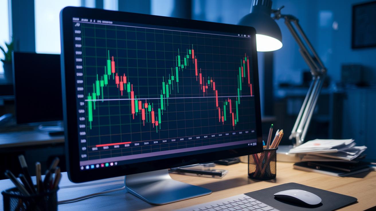
Ever wonder if you could read the crypto market like a simple, color-coded scorecard? Imagine a tool that turns live market numbers into bright tiles you can see in a glance. This heatmap dashboard works like a heartbeat check, quickly showing which coins are on the rise and which ones are falling behind. It gives traders a smart view of the trends as they form, helping you spot opportunities as they happen. In a fast-paced market, it’s a handy guide to keeping up with smart shifts.
Crypto Heatmap Dashboard: Real-Time Market Visualization
A crypto heatmap dashboard is a handy tool that turns live market data into a series of colored square tiles. It gives traders a quick look at how digital assets like Bitcoin and Ethereum are performing. Think of it as a heart check for the crypto world, where you can instantly see which coins are doing well and which ones are lagging.
The design is simple and easy to follow. Green tiles show that prices are rising, while red ones warn you of drops. The deeper the green, the bigger the gain, and a lighter shade means a smaller move. Plus, larger tiles represent bigger market players, so you know at a glance which assets are making the biggest impact.
Every minute, the dashboard refreshes with new data, updating both market cap sizes and shifts in trend. This near-real-time view helps you quickly catch on to emerging trends and make fast decisions. With a clear, dynamic layout, it’s an essential tool for navigating the fast-paced world of crypto trading.
Data Sources Powering Crypto Heatmap Analytics

Crypto heatmaps pull data from both on-chain and off-chain sources to create a clear, real-time picture for traders. They gather details like live order-book snapshots, active trade volumes, funding-rate updates, and records of liquidations. Platforms such as the Data Center and Trader’s Resource Center blend these varied streams, while APIs deliver tick-by-tick order depth. This makes the heatmap feel like the steady pulse of the market. For example, a quick look at an order-book snapshot might reveal a sudden surge in buy orders, hinting at a shift in market mood. Ever notice how fast trends can shift?
Beyond the basics, these tools also layer in data like derivatives open interest (the total amount of outstanding contracts) and smart contract gas usage (the cost of running transactions on a blockchain). This additional info paints a vivid picture of how money moves in the market, giving traders another level of insight into price trends.
Key feeds powering these analytics include:
- Order-book snapshots
- Trade-volume ticks
- Funding-rate updates
- Liquidation events
- Derivatives open interest
All these inputs merge to form dynamic visual layers on the heatmap. This helps traders track market depth and liquidity flow with precision, sparking smart decisions based on real-time data.
Interactive Filters & Metrics in Crypto Heatmap Tools
Asset Class & Timeframe Filters
One neat feature lets you toggle easily between big coins and smaller tokens using simple menus. You can also choose the time frame you want, whether it’s just one hour or a full week. For example, imagine switching to a one-day view to catch fresh moves among smaller tokens while still keeping an eye on the major players.
Overlaying Technical Indicators
Many advanced tools let you layer extra data directly on the heatmap. You might see an RSI performance view, which shows whether an asset might be too expensive or too cheap (RSI: a measure that helps indicate potential overbought or oversold conditions). There’s also a funding rate view that tracks periodic interest changes and volume-based liquidity bands (liquidity: how easily an asset can be converted to cash) for extra clarity. This visual data helps you spot key price levels and market shifts as they happen.
Customizing Liquidation Layers
Traders can even turn on interactive displays that map out Bitcoin and Ethereum liquidations. These show where clusters of heavy selling might be forming, alerting you to areas with extra pressure. This kind of customization makes it easy to see the overall market mood and risk zones at a glance.
By blending asset filters, technical overlays, and customizable liquidation layers, you get a powerful tool that highlights smart market trends clearly and simply.
Interpreting Crypto Heatmap Color Coding & Signals

Crypto heatmaps use colors and sizes to show how the market feels. Deep green means a coin’s price jumped over +5%, while light green means it moved up a bit, from 0 to +5%. On the other hand, light red or deep red signals that a coin’s price fell, whether between 0 and -5% or more than -5%. The size of each square tells you how big the coin is, bigger squares mean well-known coins that are having a big day. This setup makes it easier for traders to keep an eye on price movements.
Think of this as a heartbeat chart for the crypto world. When you see clusters of bright colors, it hints at a rush of buying or selling. Adding an RSI performance map, which helps spot when a coin is overbought (too many people buying) or oversold (too many people selling), gives even more clarity. This combo of color, size, and technical tool quickly shows key trends, whether you’re watching giants like Bitcoin and Ethereum or even smaller altcoins.
| Color | Price Change Range | Market Signal |
|---|---|---|
| Deep Green | > +5% | Strong Bullish |
| Light Green | 0–+5% | Mild Gains |
| Light Red/Deep Red | 0 to <-5% | Bearish Momentum |
For example, if you spot a large, deep green square on the heatmap for Bitcoin, that coin is not only showing a big price jump but also confirming its strong market presence. This clear visual cue makes it easier for traders to decide when to act quickly.
Integrating Crypto Heatmap into Trading Platforms

Traders are adding crypto heatmaps to their platforms more often these days. It’s like having a live view of the digital market layered right on top of your usual charts. These heatmaps use real-time signals to show you market movements quickly, making it easier to see shifts in digital assets. Whether you use TradingView or connect with a custom API, merging your charts with these dynamic overlays is straightforward.
If you’re a TradingView user, setting up a heatmap plugin is a hands-on process that really boosts your market view. First, install the heatmap indicator script. Next, connect your API key and choose the assets you want to track. Finally, set the update interval and configure the display panel. This simple process turns your chart into an interactive display of real-time data.
Following these steps means your panel becomes a hub of vibrant information. The setup ensures that data feeds are connected properly, and the dynamic, color-coded tiles show the latest changes in market cap and volume. This quick setup gives you fast alerts and a more detailed look at how crypto prices are moving.
Adding a crypto heatmap to your trading dashboard lets you catch live signals that traditional charts might miss. Platforms like Verified Network’s Apex Live Day Trading Room show how custom plugins can create a live overlay that keeps you updated on every market move. Data from tools like the Member Dashboard and Data Center, delivered through RESTful endpoints (a way for computers to communicate), makes sure every visual detail is current.
In short, this integration simplifies technical monitoring while blending classic trading setups with innovative digital insights. With these visual heat layers, you’re equipped to watch smart market trends and act on them immediately.
Advanced Heatmap Crypto Techniques & Use Cases

Skilled traders often lean on VWAP zones, which show the average price an asset trades at, to check the strength of a trend. They place VWAP overlays on a heatmap so they can clearly spot where momentum shifts occur. When you add tools like the Gann Cycle Report, which maps out repeating price cycles, it becomes easier to see patterns. For instance, if a coin breaks through a strong VWAP zone and the cycle hints at a reversal, it might be the perfect moment to jump in or get out. This method turns boring raw numbers into a lively visual guide that helps traders make better decisions.
Those who like quick plays pay close attention to minute-by-minute shifts on the heatmap. With One Minute Scalpel alerts tracking rapid changes, traders can catch tiny moves that add up to small, fast profits, what’s often called scalping. Imagine watching a digital token’s color suddenly spike; that brief flash could mean a burst of trading activity is coming, and traders might snap up the moment before the trend calms down. These minute shifts turn the heatmap into a real-time pulse of the market, proving that every second counts.
But it doesn’t stop with just cryptocurrencies. Many traders now blend these techniques across different asset classes, creating maps that mix crypto signals with data from stocks, ETFs, commodities, and more. This wider view lets you see how digital tokens move alongside traditional markets, uncovering links that might offer a fresh trading edge. In short, by combining data from different corners, traders can spot opportunities that feed into the overall rhythm of the market.
Final Words
In the action, traders experienced a unique view of digital asset markets with the crypto heatmap dashboard. The post broke down how color tiles signal quick shifts and asset strength. It explained live data feeds, interactive filters, and advanced overlays for real-time insights. These details, including heatmap crypto signals, help shape smarter investment moves. With each update, you gain a clear picture of market rhythms, paving the way to a more diverse and secure digital portfolio.
FAQ
What is a heat map in crypto?
The crypto heatmap in crypto shows a dynamic color grid using tiles that signal price changes. It helps traders quickly identify which coins are rising (green) or falling (red) in real time.
How does a crypto heatmap display liquidation data?
The crypto heatmap displays liquidation data by using real-time order book feeds that record when positions are rapidly closed. This information offers a snapshot of sudden market pressure.
How does TradingView integrate crypto heatmap data?
The TradingView heatmap crypto integrates through a custom script that links API feeds. This lets users set update intervals and choose the asset universe for live data visualization.
Can you view a crypto heatmap live?
Yes, you can access a live crypto heat map that updates every minute. This provides up-to-date visuals on price changes and market cap trends for quick decision-making.
How does a crypto heatmap use RSI data?
The heatmap crypto RSI overlays the Relative Strength Index (RSI, a momentum indicator) on the color grid. It clarifies overbought or oversold conditions alongside price movements.
Which is the best crypto heatmap available?
The best crypto heat map combines live updates, customizable filters, and clear visualization. Its intuitive design helps traders quickly assess market dynamics across major coins and altcoins.
What does “heatmap crypto coinank” mean?
The phrase “heatmap crypto coinank” refers to a tool that ranks cryptocurrencies with a color-coded grid. It offers a snapshot of market performance to help spot trending coins.
How does the crypto heatmap narrative help traders?
The heatmap crypto narrative guides traders by visualizing market sentiment. It transforms raw data into a clear story of bullish or bearish trends, supporting more informed trading decisions.
Can you make $1000 a day trading crypto with heatmaps?
Making $1000 a day trading crypto with heatmaps is challenging. While heatmaps provide critical market insights, success depends on a robust strategy, risk control, and strong market skills.
Can crypto heatmaps be misleading?
Crypto heatmaps can sometimes be misleading if viewed in isolation. They offer a quick market snapshot, so combining them with other tools and analysis is advised for a well-rounded view.